A better way to analyze customer surveys

Have you ever coded open-ended responses for a customer survey? It’s a tedious and repetitive process, to say the least. When I first saw how this is done, I immediately thought “there has to be a better way”. If you’re not familiar with how it works, here’s a quick rundown:
Copy and paste the responses for a question into the first column in a spreadsheet.
Start reading the responses from top to bottom to spot trends, themes, categories, whatever you want to call them.
When you spot a theme, write it at the top of the next free column, and for each response that matches that theme, put a 1 in the cell at the intersection of the response and the theme column.
Repeat step 3 until you have all of the responses coded for at least 1 theme.
Add up the total hits for each theme, calculate the percentage of overall responses, and put them into a summary sheet.
Repeat steps 1-5 for each additional question in the survey.
Say your survey had 10 questions, and you got 200 responses to analyze. If each response matches an average of 3 themes (some will match only one, most will match several), you’ll be manually typing 1s into cells 6000 times. That’s on top of all the copying and pasting of responses into sheets, adding up the numbers, copying them into the results sheet, etc etc.
Manual repetitive tedium aside, there are other problems with this approach:
Some questions might have blank responses.
The order of responses will be the same for each question, which can introduce bias as the analyst will know that response #5 from each question is from person #5. Sometimes this can be useful, like if each question builds on the previous ones, but it does allow bias to creep in.
If you realize partway through the process that one theme should be split up into two, or two separate ones should be combined, you have to go through those entire columns and re-code the responses again.
It’s pretty easy to get lost in a sea of 1s and blank cells and not be able to tell that you missed some responses entirely or that you just put a 1 in the wrong place.
So what’s a customer experience researcher to do? Well one option is to avoid this process entirely. There are a few ways to do this, each with their own drawbacks:
Go with multiple choice instead of open-ended questions - it makes the survey trivially easy to analyze, but then you’re putting words in your customers’ mouths and making them select from among your biases and preconceived notions about what they might be thinking. Open-ended questions are the bee’s knees of VoC research. That’s why it’s called Voice of Customer; you want to hear what they have to say in order to learn from them. Don’t take it from me, check out anything Els Aerts has said on the topic.
Use a tool to scan the responses and spit out a word cloud - again this brings the workload down to almost zero, but you give up having any sort of insight into the context of each word. Say the word “quality” comes up a lot; that could be a mix of people saying “the quality was awesome” and “the quality was terrible”. Plus those tools only count single words, so you don’t get any idea of the common phrases that your customers are using.
Let AI figure it out for you with natural language processing and sentiment analysis - you’ll definitely score some brownie points for using a shiny new AI tool, but the whole point of analyzing koalatative (or “qualitative” as some people stubbornly call it) research is to develop empathy with your customers and understand their point of view - two things that AI will never be able to do. Sentiment analysis for example can often give you the exact opposite sentiment than what was intended. If someone said “every stupid alternative I tried before this one was terrible and I hated it”, the AI would score this as very negative sentiment even though the person is clearly happy with the product.
Delegate the grunt work to someone else - then you don’t have to be the one to slog through the endless rows and columns and you can just take the output and pop it into a slide deck. The problem with this is that the person who needs to develop empathy and understanding (you) doesn’t end up having any direct contact with the customer feedback. Sure, you can do a quick scan of the responses, but this doesn’t immerse you in the VoC like doing it yourself does. And in my experience, looking at the raw data would uncover deep issues with how the responses were coded and I would end up having to re-code at least a couple of questions myself. This is because the understanding works both ways - someone who hasn’t been involved with the project, doesn’t understand the business goals, challenges, and context, and in some cases hasn’t even looked at the website in question, can’t be expected to know the meaning behind what customers are saying. So a lot of important insight will be hidden behind the neat and tidy summary of categories and percentages.
Ok so you’re committed to getting the most valuable data you can and using it to deepen your understanding of how your customers tick and you don’t want to use any shortcuts that will compromise this. But you want to do this as efficiently as possible.
Enter from stage left: the Koalatative Survey Coding Template, designed to make your life easier by taking the majority of the heavy lifting and brain-numbing tedium out of analyzing qualitative surveys so that you can focus on understanding and intelligently categorizing the responses. This includes anything from single-question onsite polls, to chat logs, to multi-question long form customer surveys.
The template is a Google Sheets document that does the following:
Filters out blank responses so that you get good responses to work with for each question.
Selects 200 randomized responses from the raw data (if you have more than 200 to work with).
Randomizes the order of responses to each question so that you can be unbiased when analyzing them.
Copies each question’s responses into a separate tab, ready to be analyzed.
Makes it easy to see which cells have been tagged by adding a nice blue background to coded cells.
Shows how many times each response has been scored so that you don’t miss any.
Provides 2 types of keyword / keyphrase search (match all and match any) that you can quickly scan, refine, and override if needed (more on this later).
Automatically tabulates the totals in the same sheet, plus sorts them and calculates percentages in a separate results tab.
What it doesn’t do:
It doesn’t act as a replacement for human understanding, that’s your job. Don’t rely too much on the keyword matching feature since this has some of the same limitations as word cloud and NLP solutions. It will match phrases instead of just words, but if you search for “quality”, it will still match the responses saying the quality was good and the ones saying it was bad. So you should always double check that the matches actually make sense and override them if needed.
Want to give it a try? Here’s the link to access the template. It’s read only, so make a copy for yourself that you can play with. There are some sample responses in there for question 1 so you can get an idea of how it looks with some data, so feel free to poke around a bit before you delete what’s in there and add your own data. You’ll need to delete the sample data in 3 places: the “Raw Data” tab, the “200 Fixed” tab, and the keywords in rows 1 to 5 from column C to X in the “Q1” tab.
Here’s the process for how to use this:
Paste the raw data into the first “Raw data” tab.
The blanks will be filtered out in the “Filtered” tab.
200 responses will be pulled and randomized into the “200 Randomized” tab.
Copy from the randomized sheet and paste values only into the “200 Fixed” sheet. Otherwise the responses will get randomized again every time you open the doc (Google Sheets issue).
Note: if you have less than 200 responses to start with, and you don’t care about filtering or randomizing them, you can skip the first steps and put them directly into the “200 Fixed” tab.
Go to the tab for each question, and scan through the responses to find themes / categories.
Put in a couple keywords or keyphrases (I’ll just call them keywords from now on but they can be phrases too) that correspond to the theme.
Note 1: you always have the option to manually put 1s in cells whether you are using the keyword search or not. Some questions lend themselves better to keyword searching (like yes/no, multiple choice, or when you ask the respondent to list competing alternatives, etc) and some need more manual work.
Note 2: the default column type is “match any” which will match any of the keywords that you enter in the first 4 rows. If you want to use “match all” instead, copy the entire column Z and paste it into the column where it’s needed. This will replace the formulas in the cells with ones that will only match if the response contains ALL of the keywords you entered.
Take a look at the responses that are matching that theme and refine the keywords if needed.
Override any hits that don’t make sense by deleting the formula from that cell.
Add 1s for any responses that the keywords didn’t catch.
Add a human readable title for the theme / category in the blue cell - this is what will be shown in the results instead of the keywords.
Look for any responses that haven’t been scored yet.
Once each response has been scored at least once, move on to the next question.
Once you’re done coding all the questions, everything will be summarized in the “Results” tab, like this:
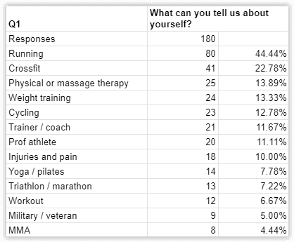
That’s it! You have a clear view of the strength of signal on each response theme for each question. Now you can get to the more challenging (but less tedious) task of drawing insights from this data and turning them into action items and test ideas, and you can pat yourself on the back for not shying away from difficult work that delivers impactful results.
Feel free to reach out to via LinkedIn if you have any questions about how this all works.
Want to know what we're up to?
We'll send you an email when we publish new content