Mapping out the website flow or how to actually start your CRO project

CRO is no doubt a complex process of different research methods, testing, design, development, and (what seems like) a million other things. Everyone has their own flow in terms of the first steps for a project so this means that when you google “how do I start a CRO project” a lot of articles come up that try to explain the meaning of CRO and tie all of these layers of complexity together.
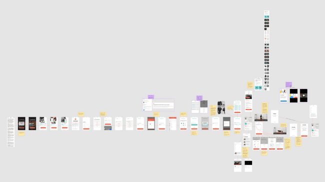
Well, I want to tell you (or maybe just remind you) about one of the most helpful practical things you can do for yourself when working on a website or app. And that is mapping out the flow visually.
Every project should start with a file that looks like a murder investigator’s whiteboard with a bunch of stuff connected to each other with red yarn. And this is not something that should only be for UX journey product owners in huge companies, anyone who is working on improving some sort of online flow can benefit from this exercise. If you’re responsible for designing, writing, analyzing, or QA-ing some part of the flow, you should have an understanding of what that flow holistically actually looks like.
This is a step that is so simple and yet often overlooked during CRO projects. Mainly because it’s kind of annoying in the sense that it requires some manual work and is not really viewed as a “deliverable” for the client. I believe this is because analysts and consultants tend to believe that the client is already hyper-aware of what their online flow already looks like. In some cases that’s true, but in my experience any time you dig into the journey and come up with heuristic findings, there is pretty much always something that is surprising to the team that works on this on a daily basis.
The process is simple - go on the website/app you’re working on, go through the funnel and get familiar with all of the logic between pages, understand which link/button leads where, and so on. Then go back to the beginning and start taking screenshots of absolutely every step of the way. Put your screenshots in an organized sequence in a visual tool (Figma and Miro are both fine choices). Write comments and notes next to everything that seems noteworthy and there you go - you have a visual of what the journey actually looks like from every angle and you can now share this with the rest of your team so everyone’s on the same page.
Taking screenshots and writing notes about every little thing that happens in the customer journey can be cumbersome, but the value of having that mental map in your own as well as the team’s collective brain is huge. There’s no point for everyone in the team to do this individually, of course, just bake this step into the process and make sure that everyone can use the material and review the flow in its entirety.
After completing this task, the next steps for your project will appear way more easily as well. Things like what to look for in analytics and what kind of questions should we ask the customers in the survey for example.
Zooming out and looking at the literal bigger picture will also help you understand the actual number of steps your users need to take to achieve what you want them to achieve. If you previously thought that your sign-up flow is fairly easy, but looking at all of these screenshots you realize that it actually takes 25 steps, then there’s probably room for some improvement.
Want to know what we're up to?
We'll send you an email when we publish new content