Case study: dedicated vs generic landing pages

Sidekick is a company focused on building the best muscle recovery tools for athletes. The products vary from muscle scrapers for Gua sha massage to vibration rollers that connect to your phone via Bluetooth. On top of that, you can download a wellness app from their website packed with personalizable recovery and mobility routines and tutorials on how to get the most out of Sidekick tools.
What the customer research showed
We had been working on Sidekick’s site optimization for a while and noticed from our own customer research that one of the big issues that kept coming up was price vs value. This is not unusual for e-commerce businesses trying to acquire new customers. People who haven’t had a personal experience with your products before will always wonder if it is worth their money and if it would actually solve their problem. There seems to be an added layer of hesitation and fear with health-related products. This is completely justified of course as health is one of the more personal topics there is.
There are similar products available that are cheaper and of lower quality, so communicating the value that Sidekick products provide is crucial.
One of the main factors that seem to alleviate these fears in Sidekick’s case is their continuous collaboration with well-known athletes like Emily Infeld, Sara Hall, Annie Thorisdottir, and Tim Tollefson.
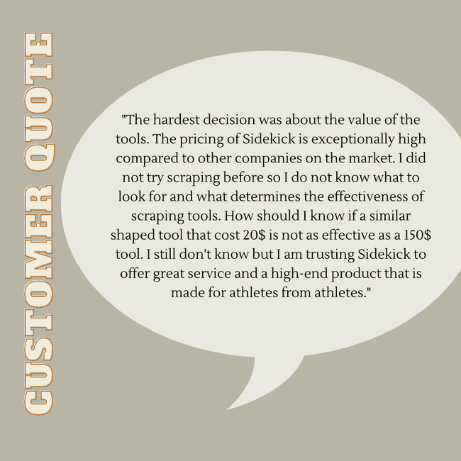
Here is a quote from a customer survey we launched and analyzed that illustrates this point even further:
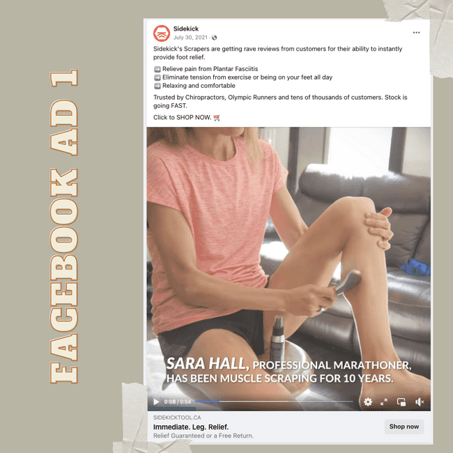
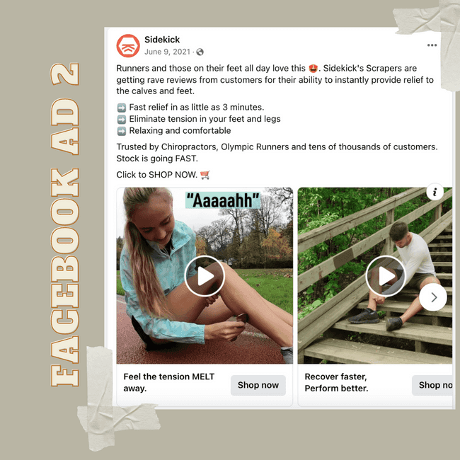
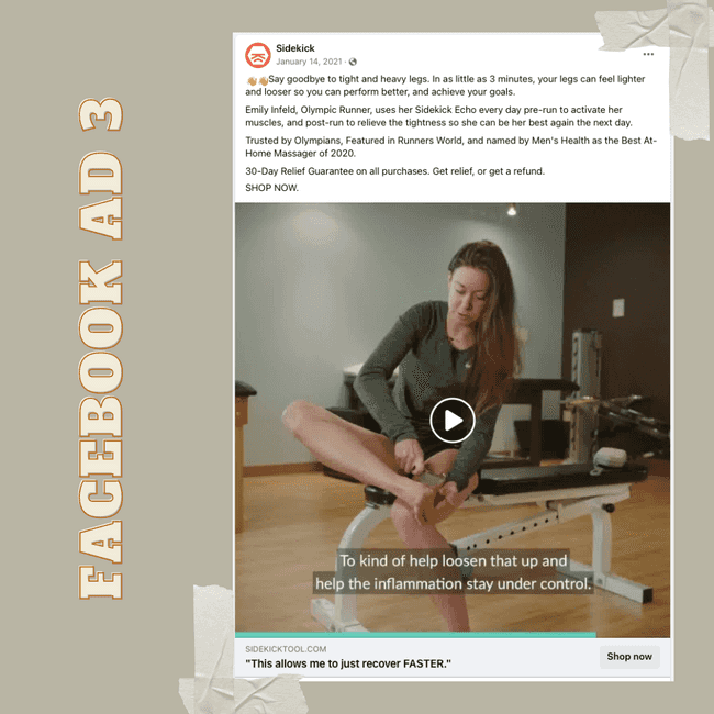
We started looking at Sidekick’s overall marketing campaigns and messaging and saw that a big part of the content in paid ad campaigns and social media already revolves around the endorsements from these great athletes and how Sidekick products have helped them in their recovery journey, preventing and healing injuries.
The problem with the landing pages
We looked at the analytics first and saw that most of the landing pages tied to Sidekick’s paid ad campaigns had a dropoff rate of over 80%. The conversion rate was extremely low as well and the paid campaigns were clearly not earning their keep.
So we took a closer look at all of the specific ads and their corresponding landing pages to understand visuals and messaging as well.
Here are a couple of examples from their Facebook ads:
After analyzing the heuristics of the ads, we took a closer look at the landing page they were leading to.
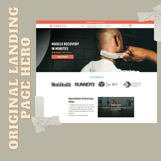
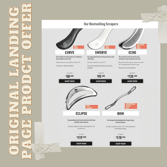
You can see that there is a huge mismatch between the ad and the landing page messaging. Customers are seeing different athletes in different ads talking about how to use a specific Sidekick tool, but after clicking through to the website, there is no mention of said athletes or the tool they were talking about. Just a very long generic landing page with five equal product offerings.
Creating the solution
We proposed a hypothesis that if we would create dedicated landing pages that would align with the ads and show the exact same athlete talking about the same tool in more detail than in the Facebook video ad, we could significantly increase conversions.
As a first step, we started combing through Sidekick's content library full of interviews and videos of these athletes talking about their favorite tools and how they use them. We wanted to make sure that each dedicated landing page not only has the same message as you would see in the ad but also as much extra valuable information as possible.
We came up with a landing page layout that would have to work for 4 different versions of the page because Sidekick was running Facebook ad campaigns about 4 different athletes at a time.
We wanted to make sure that the first thing a customer sees when landing on the page is the same athlete they saw in the advertisement. We dug through hours of video interviews to find the perfect quotes for the hero section. Here you can see the first half of the new landing page:
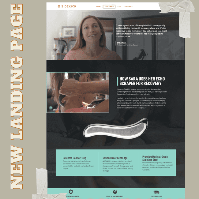
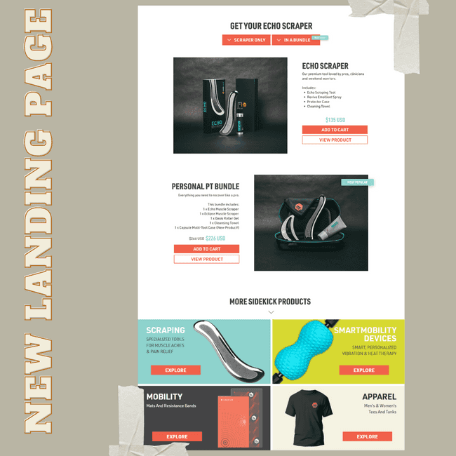
Next, we created a section on how the specific athlete in focus uses the tool they were talking about in the ad video. Only after all of this crucial information, we chose to present the option to purchase the same tool, either as an individual offer or in a bundle with added accessories.
How we ran the experiment
This experiment was a bit of a challenge to set up since we needed to redirect users to a specific landing page depending on which ad they clicked through from. The first step was to change the URL in each ad to include a parameter that specified the athlete that was featured in the ad. Initially, we thought we’d be able to build it as a single redirect test, with some logic that would read the athlete URL parameter and redirect the user to the corresponding landing page. However, this was a bit too complex for Google Optimize to handle. So instead, we set it up as 4 separate experiments where each one was targeted to one URL parameter with a redirect to the right landing page.
We still weren’t necessarily interested in how each athlete-focused landing page performed relative to each other, since the purpose of the test was to validate the overall concept of tailoring the landing page to the athlete in the ad, and having separate experiments was done only to overcome the technical limitations in Google Optimize. Plus, we would have had to run the test much longer to look at the results individually anyway, so when we were doing our analysis we added up the numbers for all 4 Optimize experiments and treated them as if they were a single test.
The results
The main focus of this test was to get the users who click through from the ads to take a meaningful high-intent action once they are on the site instead of just leaving, so we chose cart adds as the primary metric and kept an eye on the transaction conversion rate to make sure it was at least moving in the same direction.
After running the experiment for 5 weeks, we observed a 33.3% lift in the add-to-cart rate (at over 90% significance) and a corresponding 8.16% lift in the transaction CR.
Learnings
Together with the Sidekick team, we decided to implement this new version of the landing page.
From a CRO/AB tester’s perspective it would be pretty easy to call this a no-brainer - make the landing page correspond to the ad and you’re all good to go. But that doesn’t mean it shouldn’t be tested, plus what we’re looking at here is a much bigger issue with the landing page creation process on many websites.
Most companies seem to think of landing pages as a one-off project. We see this constantly with clients where the company has invested in creating either one landing page or worse yet, treats the home page as the main landing page on the site and sends absolutely every campaign created to that one page.
After some evaluation, we can see that the landing page is not performing as expected and a lot of money was wasted on a campaign, so the conclusion is often that the campaign was underperforming and we should just try again with a new one. The reality is that a landing page trying to serve several different campaigns is not a landing page at all. This is exactly what we learned yet again in this case.
Landing page creation process needs to be an ongoing process. A completely new campaign requires a completely new landing page for optimal performance. The ad team needs to work closely with the web team to create a holistic experience and make sure that every landing page is matched to the campaign that is sending traffic to it, otherwise there is no continuation of the story. Your story gets broken into pieces and the conclusion is missing which will drag down your conversion rates.
Need help figuring out how to make your own landing pages perform better?
read more about our servicesWant to know what we're up to?
We'll send you an email when we publish new content